Design techniques to enhance visual communication in personal projects
Maximizing Impact Through Design
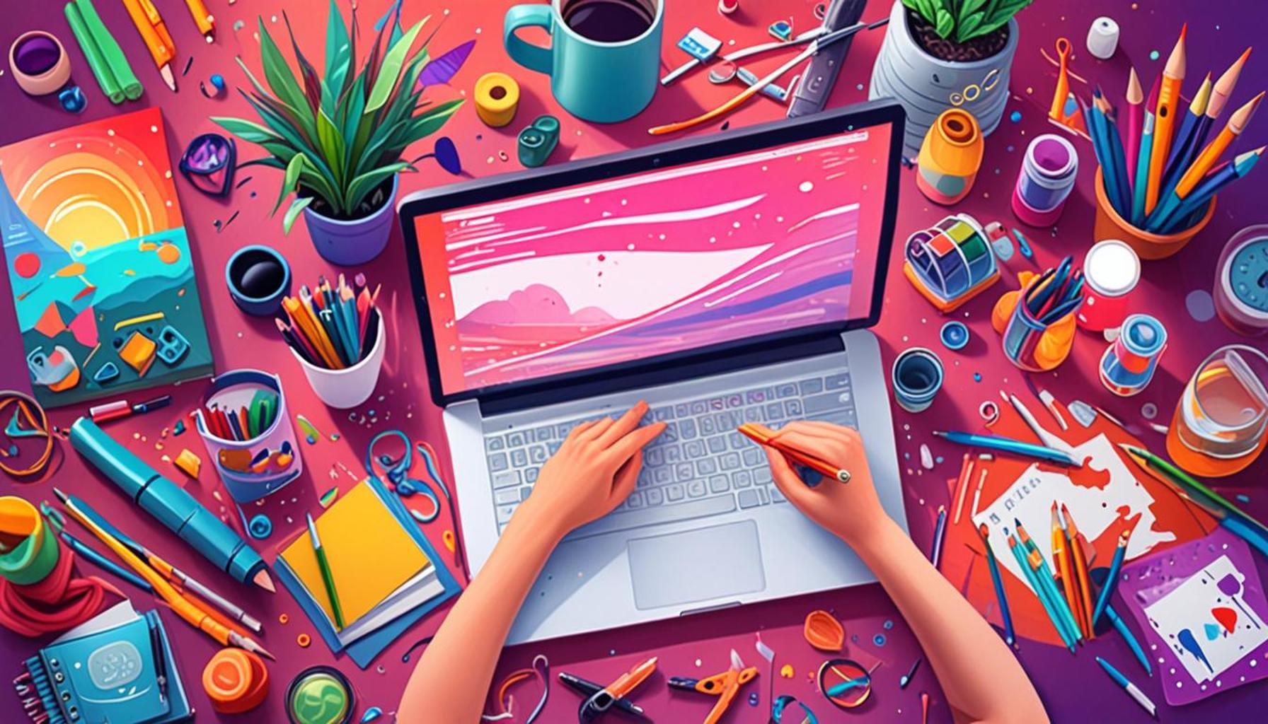
In today’s fast-paced world, effective visual communication is crucial for standing out in any personal project. With the right design techniques, you can transform ordinary presentations, portfolios, or social media graphics into compelling narratives. Understanding how to capture attention and convey your message clearly is key to making a lasting impression.
Here are some core principles to consider:
- Color Theory: Color plays a pivotal role in visual design by evoking specific emotions and setting the tone for your project. For instance, warm colors like red and orange can generate excitement and urgency, while cool colors such as blue and green often foster calmness and trust. By carefully selecting a color palette that aligns with your message, you not only create a cohesive aesthetic but also enhance the emotional resonance of your work. For example, brands like Facebook utilize blue to convey a sense of reliability and community.
- Typography: The choice of fonts can significantly impact the perception of your message. Different typefaces can evoke different feelings; for instance, serif fonts often communicate tradition and reliability, while sans-serif fonts are perceived as modern and approachable. Pairing fonts effectively is just as crucial. A common practice is to use a bold headline font that draws attention alongside a simple body font that enhances readability, thus improving the overall comprehension of the text.
- Imagery: High-quality visuals are essential for capturing attention and reinforcing your narrative. Whether it’s photographs, illustrations, or infographics, the imagery you choose should complement your message and resonate with your audience. For instance, using relatable images in a marketing campaign can create a connection with the viewer. In contrast, using generic stock images can evoke apathy. Research has shown that posts with engaging visuals on social media receive 94% more views than text-only posts, highlighting the critical role of imagery.
- Layout: A well-organized layout guides the viewer’s eye and enhances the overall flow of the content. Using the principles of hierarchy, balance, and alignment helps to present information in an easily digestible manner. For example, utilizing white space effectively not only prevents clutter but also draws attention to critical elements, ensuring that your audience remains focused on the key messages.
Incorporating these techniques not only improves the attractiveness of your projects but also ensures your audience understands your point of view. Whether you are working on a personal blog, a freelance assignment, or a community event, effective design can elevate your message and make it memorable.
As we explore these design strategies, you will discover how small adjustments can lead to substantial improvements in how your work is perceived. From the color of your call-to-action button to the choice of imagery that depicts your story, every detail counts. Delve into the world of design and learn to communicate visually with clarity and purpose. By mastering these principles, you will not only improve your projects but also gain an invaluable skill in today’s visually-driven landscape.
DISCOVER MORE: Click here to dive deeper
Key Design Elements for Effective Visual Communication
To transform your personal projects from mundane to memorable, it is essential to harness certain design elements that elevate visual communication. By focusing on aspects such as color choices, typography, imagery, layout, and consistency, you can significantly enhance the way your audience perceives your work. Let’s delve deeper into these crucial components.
Color Choices
As mentioned earlier, color theory is more than just an aesthetic choice; it can influence emotions and perceptions at a subconscious level. To take full advantage of this, consider creating a color palette that reflects your project’s essence. Tools like Adobe Color or Coolors allow designers to experiment with different color combinations and discover trending palettes. Additionally, understanding the psychology behind colors can shape your audience’s reactions; for example, using green could imply growth and environmental responsibility, which is especially relevant in sustainability-focused projects.
Typography Mastery
Your typography should align with the tone of your content. For example, if you are designing a project aimed at tech-savvy individuals, a sleek sans-serif typeface might be ideal, while an elegant serif font could enhance a project centered around luxury or tradition. To maintain harmony, adhere to a maximum of two or three fonts throughout your project. This approach prevents visual chaos and helps in establishing a clear identity.
Investing in Quality Imagery
When it comes to imagery, the adage “a picture is worth a thousand words” rings true. High-resolution images or creative graphics can effectively convey your message and engage your audience on a deeper level. Consider using platforms like Unsplash or Pexels for free, high-quality images that can complement your content, or invest in custom graphics tailored to your specific project. According to studies, visuals are processed 60,000 times faster than text, making the selection of your imagery a pivotal aspect of your design.
Strategic Layout Design
The layout of your project contributes greatly to the viewer’s experience. A well-structured layout guides the audience seamlessly through the information you present. To achieve this, utilize principles like balance and white space. Balance ensures that no part of your layout overwhelms another, while white space creates breathing room, allowing viewers to focus on essential elements without distractions. A grid system can be instrumental here, helping you create a clean and organized design that improves usability.
- Hierarchy: Use size and placement to indicate the importance of elements, leading viewers to the most crucial information first.
- Consistency: Maintain uniformity in color scheme, typography, and layout throughout your project to reinforce your brand’s identity.
- Responsive Design: Ensure your designs adapt seamlessly across devices—desktop, tablets, and smartphones—thereby reaching a wider audience.
By focusing on these key design elements, you can tremendously boost the effectiveness of your visual communication in personal projects. The investment of time and effort into understanding and applying these principles will undoubtedly yield a more cohesive and impactful message.
Design Techniques to Enhance Visual Communication in Personal Projects
Visual communication plays a crucial role in conveying messages effectively in personal projects. Utilizing design techniques strategically can transform a simple piece of content into a compelling visual narrative. Below, we explore essential advantages of integrating advanced design principles into your personal projects through the following table:
| Category | Advantages |
|---|---|
| Color Theory | Using color palettes can evoke emotions and create brand recognition. |
| Typography | Choosing the right font styles enhances readability and establishes tone. |
| Visual Hierarchy | Establishing visual hierarchy helps guide the viewer’s attention to key elements. |
| Consistency | A cohesive design fosters trust and professionalism in your projects. |
Integrating these design techniques not only enhances the aesthetic appeal of your work but also facilitates better understanding and retention of information presented. By mastering these elements, anyone can significantly elevate the impact of their personal projects, making them more memorable and engaging for their audience.
DISCOVER MORE: Click here for creative card ideas
Advanced Techniques to Elevate Your Visual Communication
Having established foundational design elements that enhance visual communication, it is crucial to explore advanced techniques that can further elevate your personal projects. Employing methods such as infographics, data visualization, animation, interactivity, and user feedback can shift how your audience interacts with your content and consequently boost engagement. Let’s delve deeper into these cutting-edge techniques.
Infographics for Information Simplification
Infographics serve as an excellent means to distill complex information into easily digestible visual formats. By blending text and visuals, infographics can simplify statistical data or multi-step processes that may otherwise overwhelm your audience. Tools like Canva or Piktochart facilitate the creation of eye-catching infographics that can convey your message clearly and effectively. For instance, a personal project focused on climate change could benefit from an infographic illustrating the impact of carbon emissions in an engaging manner, allowing viewers to grasp critical information quickly.
Data Visualization for Enhanced Insights
In an age where data-driven decision-making reigns supreme, utilizing data visualization can be a game-changer for your personal projects. By transforming raw data into engaging graphs, charts, or interactive dashboards, you provide viewers with an immediate visual context. Programs like Tableau or Google Data Studio enable you to create compelling visuals that encourage users to explore data at their own pace. For example, if you’re designing a project related to health and fitness, presenting your progress through graphical representations can help convey your journey to the audience much more compellingly than textual updates alone.
Animation: Adding a Dynamic Element
Incorporating animation into your designs can add a dynamic element that captures attention and adds life to your presentation. Whether it’s a subtle transition or a complete animated story, movement can engage viewers in unique ways. Platforms like Adobe Animate or After Effects allow creatives to develop dynamic experiences for their audience. For example, a personal blog on travel could use animated maps to illustrate routes taken, providing an exciting and interactive way to recount experiences visually.
Interactivity: Cultivating Engagement
Encouraging audience interaction can significantly enhance visual communication. Features like clickable buttons, quizzes, or scroll-triggered animations foster an immersive experience, prompting viewers to engage actively rather than passively consuming content. Tools such as Figma or Webflow can help create interactive designs that provide this level of engagement. A great instance would be an interactive landing page for a photography portfolio, allowing users to click through categories or hover over images for pop-up information, thereby creating a personable experience with your artwork.
Leveraging User Feedback
Lastly, incorporating user feedback is an often-overlooked yet powerful technique in design communication. By collecting and analyzing comments or suggestions on your work, you can make informed design choices that resonate with your audience. Utilizing platforms like UserTesting or even conducting simple surveys can yield valuable insights into what resonates or fails to connect. This approach not only fosters community but also empowers you to refine your visual communication continually. For instance, adjusting color schemes or layouts based on user feedback can refine a project infinitely more than creating in a vacuum.
While fundamental design elements serve as the backbone of visual communication, integrating these advanced techniques can significantly enhance the effectiveness and engagement of your personal projects. By harnessing infographics, data visualization, animation, interactivity, and user feedback, you can craft a compelling narrative that keeps your audience not just informed but truly invested.
DIVE DEEPER: Click here to discover creative techniques
Conclusion: Transforming Your Visual Communication Journey
In summation, the art of visual communication is a multifaceted discipline that transcends simple aesthetic appeal; it is about effectively conveying your message and engaging your audience. By applying advanced design techniques such as infographics, data visualization, animation, interactivity, and leveraging user feedback, you enhance not only the visual appeal of your personal projects but also their communicative power.
These techniques empower you to present information in ways that resonate with your audience, turning complex data into easily digestible insights and sparking engagement through dynamic elements. For instance, a project showcasing community initiatives could harness infographics to clarify statistics while interactive features encourage viewer participation, effectively drawing them into the narrative.
Beyond just presentation, prioritizing user feedback allows for continuous improvement, creating a loop of engagement that benefits both the creator and the audience. By listening to your audience’s preferences and making data-informed design choices, you forge a connection that elevates the overall experience.
As you embark on your next personal project, consider integrating these techniques to transform your approach to visual communication. The fusion of creativity and analytics will not only make your work stand out but also foster a deeper understanding and appreciation of the message you wish to impart. Thus, strive for innovation and engagement in your designs, ensuring that your audience is not just passive observers but active participants in the story you tell. Your visual communication journey is an opportunity—seize it with enthusiasm and creativity!